The museum finally admits the chart is an artwork
On 27 September, the Museum of Modern Art in New York opened the first exhibition in its history devoted entirely to information design. Full Disclosure: The Edge of Information Design, on view in the museum's street-level gallery — free and open to the public — through 13 June 2027, gathers 30 digital and analog works, including six newly acquired pieces, around a single unsettling question: if data shapes how we understand the world, who shapes the data we see?
The show is organised by Paola Antonelli, senior curator in MoMA's Department of Architecture and Design and the museum's director of research and development, with curatorial assistant Jules Bernstein and Forrest Pelsue, a 2025–26 Marron Research Consortium fellow. Antonelli is one of the most influential design curators working today, and her framing of the exhibition goes straight at the anxieties of the moment. "As data has become a defining feature of contemporary life, its visualization has evolved into one of the most consequential design fields of our time," she said in the museum's announcement. "The objectivity of data, in particular, is increasingly under scrutiny, as public confidence in institutions and in the intelligence they produce is decreasing."
It is a striking admission from a major institution: that the charts, maps, dashboards and infographics through which we encounter everything from elections to epidemics are not windows onto reality but designs — choices about what to count, what to leave out, and what form the truth should take.
Warming Stripes at the door
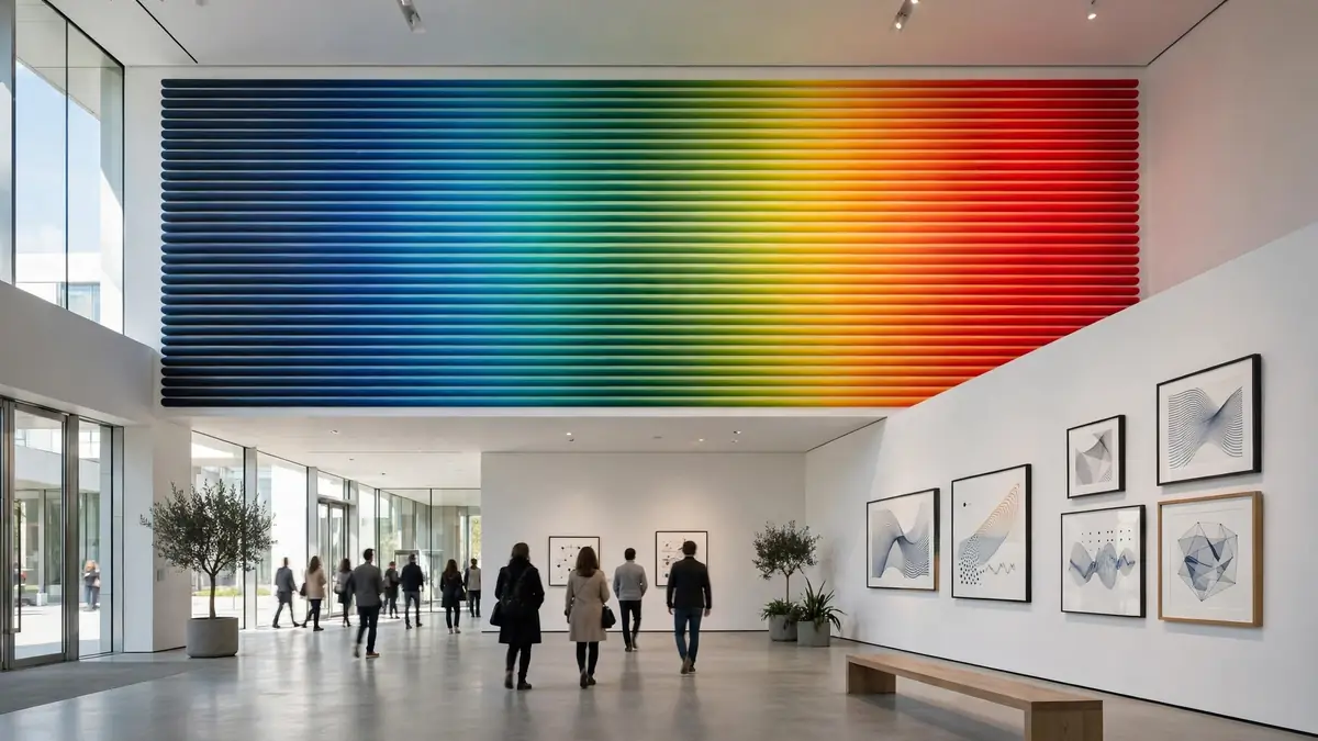
The first piece visitors encounter is Warming Stripes by climatologist Ed Hawkins — a sequence of coloured bars running from deep blue to bright red, each representing the average temperature of a year from 1850 to the present. Hawkins, as the exhibition notes, "wanted to find a way to drill it in people's brains that global warming is really happening." The imagery, as one critic observed, resembles a gorgeous rug — and also a huge warning sign.
For Antonelli, the stripes are an ideal distillation of what information design does. The field, she argues, "takes phenomena big and small, public and intimate, complex, scientific, and statistically more superficial, and renders them in a way that is comprehensible by a wide audience." The stripes need no legend, no axis labels, no statistical training: a child can see that the world is getting hotter. That is precisely what makes them powerful — and precisely what makes them design, not nature.
During a walkthrough of the exhibition ahead of its opening, Antonelli suggested the show is also a statement about the museum itself. The pieces in Full Disclosure, she said, "tell us the fact that the museum is always ready to understand what is important to the world in that particular moment, and to try to give the best examples of it." Adding: "Having an exhibition about information design shows that we're continuing our mission to talk about the art in our time, of our time."
Dear Data, Calculating Empires and the politics of seeing
Among the 30 works on view are pieces that will be familiar to design audiences and revelatory to everyone else. Giorgia Lupi and Stefanie Posavec's Dear Data — the celebrated 2015 project in which two designers exchanged hand-drawn postcards visualising a week of their lives at a time, from "a week of schedules" to "a week of complaints" — appears as a reminder that data visualisation can be intimate, idiosyncratic and handmade, not just the output of software. It is information design as correspondence, as friendship, as slow attention.
At the other end of the scale sits Calculating Empires by Kate Crawford and Vladan Joler, a work that maps the infrastructures of artificial intelligence — the mines, the data centres, the supply chains, the labour — onto a single vast diagram. Where Dear Data shrinks the world to the size of a postcard, Calculating Empires expands a single technology into a planetary system. Together they demonstrate the exhibition's central claim: that the same visual language can make the personal legible and the infrastructural visible.
The title Full Disclosure carries a productive tension. No visualisation can show everything. Every map has boundaries; every diagram selects information; every interface establishes priorities; every dataset depends on decisions about what gets collected, how it is classified and how it is presented. The exhibition invites viewers to look not only at what a visualisation tells them, but at how it tells them — a distinction that becomes especially significant as artificial intelligence and automated systems increasingly generate, classify and interpret information on our behalf. The question is no longer simply whether information is available; it is who structures it, which assumptions are embedded within it, and how visual form influences human interpretation.
Why now, and why at MoMA
It is worth asking why the world's most famous museum of modern art waited until 2026 to mount its first exhibition devoted to information design. Part of the answer is that the field has only recently been recognised as a design discipline in its own right, rather than a supporting tool for journalism, science or government. The museum's announcement makes that case explicitly: information design has evolved into "a defining practice of the 20th and 21st centuries and a pillar of the Museum's design collection."
Another part of the answer is the moment. Public confidence in institutions and in the intelligence they produce is decreasing, as Antonelli puts it — and in that climate, the people who translate raw data into visible form acquire a new kind of power. Information designers, in her phrase, are "reporters and translators, offering us not absolute truths but, rather, clearly sourced, specific, and explanatory visual takes that leave room for interpretation — even imagination."
That last clause — "even imagination" — is doing a lot of work. It is a rebuke to the idea that data visualisation is a purely technical exercise, and a claim that the best information design is a creative act. The show, the museum says, also seeks to recognise the fundamental role of information design in "unveiling and clarifying systems of power" — rendering complex phenomena and global infrastructures legible while revealing who benefits from them.
A free gallery, and what it signals
The decision to stage Full Disclosure in MoMA's street-level gallery, which is free and accessible to the public, is significant. It means the exhibition about how information reaches the public is itself designed to reach the public — no ticket, no queue through the paid galleries, just a walk-in encounter with the visual language of the data age. For New Yorkers and visitors alike, it lowers the barrier between the museum and the street at exactly the moment when the museum is arguing that design belongs to everyone.
For audiences in London, Toronto, Sydney and beyond who cannot visit in person, the exhibition still matters as a signal. MoMA's design department has a long history of anointing the important questions of the moment — its past exhibitions have shaped how the world thinks about everything from automobiles to video games. If the museum is telling us that the defining design question of the late 2020s is who gets to shape the data we see, it is worth listening.
The exhibition runs until 13 June 2027. In an era of infinite scroll and algorithmic feeds, it offers something unfashionable and valuable: a room, free to enter, in which to slow down and ask the simplest and hardest question about every chart you have ever believed — who made this, and why did they make it look like this?
Sources